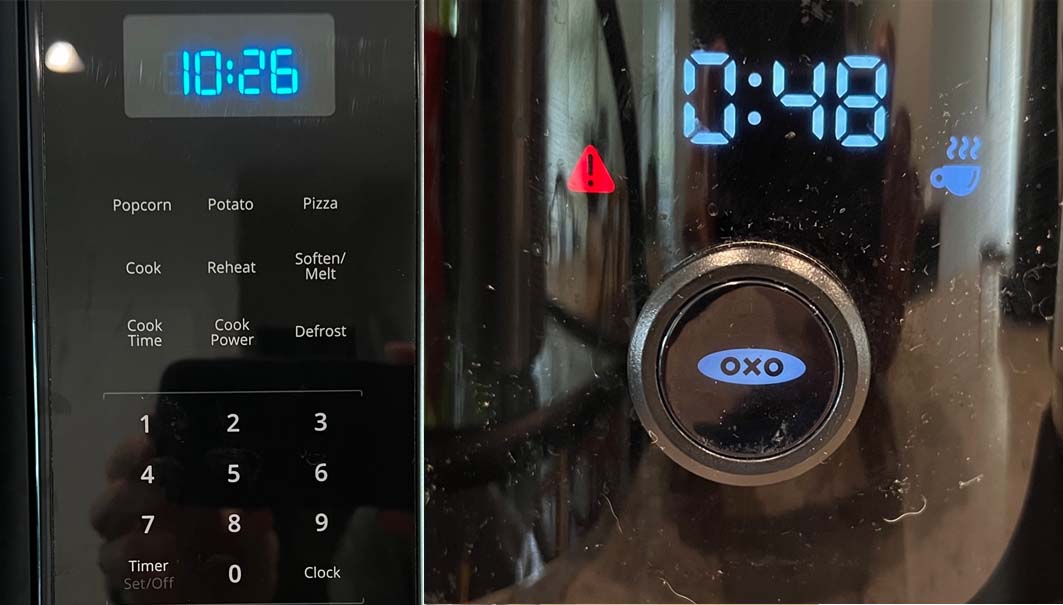
I took two pictures of clocks in my kitchen this morning, on the left is the microwave, on the right, the coffee maker. Which time is correct and what’s the key clue?
If you guessed microwave because it’s about the time I actually start working in the morning, you’d be half right.
The answer? The microwave’s clock is correct, and the clue is the Clock button on the lower right. Click that, enter the time, click Clock again, and you’re done. Easy peasy.
In contrast, the coffee maker (a gift from my software-engineer daughter) features a spare interface I can reliably use to brew coffee every AM. But when we lose power every few months, I have to check the manual to reset the clock. Since I have four clocks in my kitchen, plus a watch and iPhone within reach at all times, I typically don’t bother. If it’s not intuitive and is otherwise non-essential, it doesn’t get fixed.
I thought of these clocks recently when I was trying out a new video editor that will remain nameless. The interface was neat and clean and free of almost all icons or obvious menus. It was beautiful. Just one problem. I’ve been editing video for over 30 years, and I couldn’t figure out how to split a clip or insert a transition. Or any of the other dozens of basic tasks essential to editing.
The predictable happened; I got frustrated and I gave up.
The Raison D’etre for the UI
From my perspective, the “reason for being” of the user interface, whether hardware or software, is to make the product easy to use. To get me up and running and functional as quickly as possible. It’s not to look good, or clean, or to win design awards. If the choice is between removing a button or simplifying operation, you should always choose the latter.
It’s both interesting and instructive that during the last major round of updates, the Adobe Premiere Pro development team focused on simplifying operation for new users. This makes perfect sense; the faster you get new users productive, the more utility they derive from your product, and the more likely they are to continue using it.
While I’ve mentioned video editing software twice, the lesson holds true for all products and services, consumer and professional. Recently, I started working in two cloud environments after working with AWS for years. The discrepancy in ease-of-use was remarkable, with AWS head and shoulders easier to use and more polished. Sure, most functions will be accessed by programmers who have more technical capabilities and patience than I have, but all other factors being equal, even programmers will use the interface that’s more accessible.
Ease-of-use is even more important when users can trial your product before committing, which is increasingly the case. Even if your functionality or value proposition is better, the product or service the prospect gets up and running first will usually win.
A Brief Diversion
For perspective, I got my start in high tech in the mid-80s, as manager of a small group that built a product that allowed a computer to send a fax, a critical feature for an incredibly short period of time. As part of the marketing efforts, I’d take the product out on press tours, and demonstrate it to outlets like PC Magazine, PC World, InfoWorld, and Byte.
I came from the administrative side with a background in law and accounting, and I was technically illiterate. So our group’s four engineers, three Ramblin Wrecks and an outlier from Clemson, strove to make the product “president-proof,” or easy enough for me to successfully demo to the editorial gods that largely determined our fate.
The term “president proof” played well during these press meetings, and the usability favorably distinguished our product. A couple of PC Magazine Editor’s Choice and an InfoWorld Product of the Year award helped build retail sales and we were ultimately acquired by then modem giant Hayes Microcomputer. Two career stops later was a compression company that started me down the windy road that led me to where I am today. Along the way was about a twelve-year span reviewing hundreds of products for PC Magazine, where I become the dispenser of Editor’s Choice awards, often applying the same “president proof” usability standard.
Though this all occurred before the turn of the century, the lessons learned are still the same. Don’t sacrifice usability upon the altar of design. The product or service that’s up and running the quickest and easiest usually wins the race.
 Streaming Learning Center Where Streaming Professionals Learn to Excel


